Hot to create a pie Chart
In this section we will show you how to create a Pie Chart. We already created a simple example in addChart, but now we will take a look at how real data is created and displayed from input values.
When making a calculator the data normally has to be… calculated (surprising, right?) based on the input given by the user. Then we have the option to show this set of data as a line, area, bar or pie chart. To show the possibilities of each and the differences between them we have created one example specifically for each type of chart.
Practical example
The pie chart is a very different chart to bar, area and line charts both in terms of the type of data it requires and in the way it displays such information. Pie charts don’t show change over time (or any other variable) they simply represent graphically the proportionality between different variables.
For our example we have 4 variables, whose value is set by the user directly. We then represent them in a pie chart where the total area of the circle (a.k.a. pie) is the sum of all the variables. The area of each variable is proportional to its value.
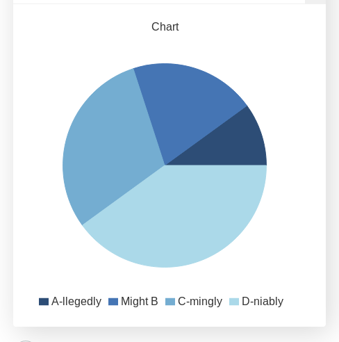
Example of a pie chart with two user defined functions
Unfortunatelly we don’t really get to chose colors in a pie chart, eventhough the possibility is technically there. We will see more after the example code.
See also
We have created a calculator using this code so that you can see the results for yourself. Check it out at Charts (pie) on BB
Code and comments
Let’s look that the example code now:
1 2 3 4 5 6 7 8 9 10 11 12 13 14 15 16 | 'use strict';
omni.onResult(['tots'],function(ctx){
var chartData = [{name: 'A-llegedly', value: ctx.getNumberValue('a')},
//{},{},{},{name:''},{},{},
{name: 'Might B' , value: ctx.getNumberValue('b')},
{name: 'C-mingly', value: ctx.getNumberValue('c')},
{name: 'D-niably', value: ctx.getNumberValue('d')},
];
ctx.addChart({type: 'pie',
data: chartData,
title: "Chart",
afterVariable: "",
alwaysShown: false
});
});
|
We have mentioned before the inability to select colours in a pie chart. The reason is that when we create empty data, an entry gets added to the legend. So we have to chose between a legend that doesn’t make sense or a fixed order of colours. We do recommend to settle for the later.
You can see the effect of empty values on both the legend and the colours of the chart by uncommenting line 5 in the calculator. Here is a preview:
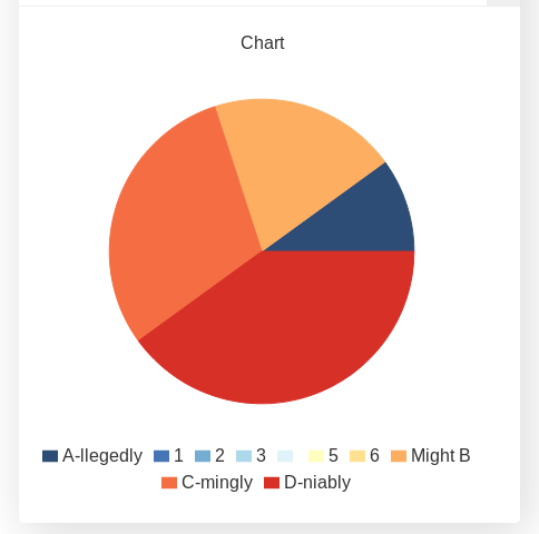
Example of using custom colours on a pie chart