Graphs and charts (Extra)
It is now time to take a look at some more advanced ways to use the ``addChart`` function. In this section we will cover a couple common ways to get more functionality out of charts as well as tackle some issues that can arise when using them.
Limit data size (Avoid computational slow-downs)
The code that we create in customJS is ran by the user’s computer, which means we need to be mindful of the resources we are taking in the computation process. A good rule of thumb is that for every thousand iterations in customJS an average computer would take approximately 1sec [1].
You will have to make the final call yourself as to how many points your chart needs, but you really shouldn’t go over 10000 points as it will take so much time that it will trigger an error message in the browser.
To prevent users from creating charts with too many points there are several strategies. One of them is simply to limit the maximum number the user can input with a simple condition like in the Binomial Distribution
There are also ways to allow any input values while keeping the number of points in the graph under control. We will show here the simplest way to define a constant number of steps that will be independent of the input parameters.
See also
We have created a calculator using this code so that you can see the results for yourself. Check it out at Dynamic Graph (number of points) on BB
Let’s look at the code now:
1 2 3 4 5 6 7 8 9 10 11 12 13 14 15 16 17 18 19 20 21 22 | 'use strict';
omni.onResult(['a','b','offset','n'],function (ctx){
var chartData = [],
n = ctx.getNumberValue('n'),
a = ctx.getNumberValue('a'),
b = ctx.getNumberValue('b'),
offset = ctx.getNumberValue('offset'),
nSteps = ctx.getNumberValue( 'nSteps'),
iterStep = mathjs.abs(a-b)/(nSteps-1);
for(var i = a; i <= b; i += iterStep){
chartData.push([mathjs.format(i,2), // x-value
mathjs.pow(i, n)+offset // y-value
]);
}
ctx.addChart({type: 'line',
labels: ['x', 'y1'],
data: chartData,
title: "Chart",
afterVariable: "",
alwaysShown: false
});
});
|
The relevant lines have been highlighted, in them we first define an iteration step, based on number of steps we want, and then we use that iteration step in out for loop. Adding the “or equal” part of the condition in the loop and using nSteps-1 guarantees we will have exactly the number of points we want.
Note
In this calculator nStep can be changed by the user in Advanced Mode only so that we can easily interact with it. In most calculators this number will be hard-set by the calculatorian in the code.
A word on user defined chart type
Another useful thing in certain calculators could be letting the user decide what type of chart they prefer. This only works for line, area and bar charts, since pie charts use a different data format.
See also
We have created a calculator using this code so that you can see the results for yourself. Check it out at Dynamic Graphs (chart types) on BB
Let’s take a look at an example:
1 2 3 4 5 6 7 8 9 10 11 12 13 14 15 16 17 18 19 20 21 22 23 24 25 26 27 28 29 30 31 32 33 34 35 36 37 38 39 | 'use strict';
var aB = omni.createValueSelect({
y: {"name":"line","value":"0"},
yN:{"name":"area","value":"1"},
nY:{"name":"bar" ,"value":"2"},
n: {"name":"pie" ,"value":"4"}
});
omni.onInit(function(ctx){
ctx.bindValueSelect(aB, 'chartType');
ctx.setDefault('chartType', "0");
});
omni.onResult(['a','b','offset','n'],function(ctx){
var chartData = [],
n = ctx.getNumberValue('n'),
a = ctx.getNumberValue('a'),
b = ctx.getNumberValue('b'),
offset = ctx.getNumberValue('offset'),
iterStep = mathjs.abs(a-b)/99,
chartType = ctx.getNumberValue('chartType'),
chartName = ['line', 'area', 'bar', 'pie'];
for(var i = a; i <= b; i += iterStep){
chartData.push([mathjs.format(i,2), // x
mathjs.pow(i, n)+offset // y
]);
}
if(chartType == 4){
ctx.addHtml('The <strike>CAKE</strike> pie is a lie');
}else{
ctx.addChart({type: chartName[chartType],
labels: ['x', 'y1'],
data: chartData,
title: "Chart",
afterVariable: "",
alwaysShown: false
});
}
});
|
As you can see in the example above, the user is given a value select so that she/he can chose which chart is best for the data. We have taken into account that pie option will give out an error and decided to show a message instead of letting the calculator crash.
Warning
If you let the user select the type of chart, make sure the data will be in the correct format. In the example we have left the option pie in the value select for educational purposes, but you don’t need to.
Remember that this is just an example, you should feel free to create your own conditions an behaviours. Each chart can represent different variations of the data or use different colours.
Tip
It is better to give less options to the user than to show error messages. In this example, the best procedure will be to disable the option pie on the value select.
Custom labels (x-axis)
We will now look at a little special problem feature of our charts: the x-axis. Our charts do not process the data on the x-axis. The data on the x-axis is treated as a label only and the data on the y-axis is assumed to be equally spaced.
This is generally a handicap, but it can be turned around by using strings as x-data.
See also
We have created a calculator using this code so that you can see the results for yourself. Check it out at Dynamic Graphs (X-axis) on BB
The code for this example is rather long due to the setup process, so it will be omitted from the documentation. Instead, we will show you an image of what it would look like when using non-standard numerical values:
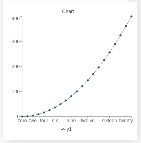
Example of custom values for the x-axis
This options can come in handy when trying to display time on the x-axis. You can use the Play with time functions in our repository to format time values and make your chart easier to understand. For example, instead of showing the years as a decimal number you can display also the name of the month.
Red for negative values
A useful trick for charts is to show different parts of the data in different colours. It could show important or special parts of the data and can help with the visualisation since none of the charts show clearly where the origin of coordinates is.
One way to apply this, specially useful in finance, is to show negative values in red. For that, all we need to do is define the order in which the data is placed on the array according to its value.
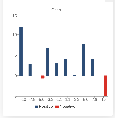
Example of a bar chart with negative values in red
See also
We have created a calculator using this code so that you can see the results for yourself. Check it out at Chart (red for negative) on BB
For our example we have chose a function that goes above and below 0 (zero) fairly often: f(x) = cos(x)*x+offset1 from x=a` to x=b. The values of a, b, and offset1 being defined by the user.
Let’s see the code:
1 2 3 4 5 6 7 8 9 10 11 12 13 14 15 16 17 18 19 20 21 22 23 24 25 26 27 28 29 30 31 32 33 | 'use strict';
omni.onResult(['a','b','offset1'],function(ctx){
var chartData = [],
n1 = ctx.getNumberValue('n1'),
n2 = ctx.getNumberValue('n2'),
offset1 = ctx.getNumberValue('offset1'),
offset2 = ctx.getNumberValue('offset2'),
a = ctx.getNumberValue('a'),
b = ctx.getNumberValue('b'),
onePoint =[],
yValue,
nSteps = 10,
iterStep = mathjs.abs(a-b)/(nSteps-1);
for(var i = a; i <= b; i += iterStep){
yValue = mathjs.round(mathjs.cos(i)*i+offset1, 2);
if(yValue >= 0){
onePoint = [mathjs.format(i,2), yValue];
}
else{
onePoint = [mathjs.format(i,2),,,,,,,,,, yValue];
}
chartData.push(onePoint);
}
ctx.addChart({type: 'bar',
labels: ['x', 'Positive',,,,,,,,, 'Negative'],
data: chartData,
title: "Chart",
afterVariable: "",
alwaysShown: false
});
});
|
You can see here that the value of the function is stored in a different position in the array depending on its value. This corresponds to a different colour.
One of the downsides of this method are the fact that the bars are half as wide as they would be on their own. Another downside is the need for 2 different labels.
This can be performed with any type of chart (except pie). It has been exemplified in a bar chart since this is one the best fits; area charts are also great candidates.
Footnotes
| [1] | The relationship is not necessarily linear. Tested on an Intel i5-3320M CPU @ 2.60GHz processor from 2012. |